What a logo on a hanger is for
A hotel or a brand puts its mark on a hanger for one of two reasons: so a guest knows who furnished the room, or so a customer knows who made the garment. The first wants a mark that is present but quiet. The second wants a mark that reads across a shop floor. Neither wants a mark that looks stuck on.
Every method below is a different answer to the same trade-off between visibility and subtlety — and each one ages differently, which matters because a hanger outlives most of what it holds.
Why a hanger carries a mark at all
Three reasons, and they lead to different specifications. A hotel marks the hanger so the room feels furnished rather than equipped. A brand marks it so the hanger participates in the display. A distributor marks it so the range has an identity in a market where the factory is invisible.
Each reason implies a different size, position and subtlety. A hotel mark that reads across a room is shouting in a guest's wardrobe; a distributor mark that is invisible at arm's length does nothing in a shop. The method follows the reason, not the other way round.
The two audiences
A guest sees the hanger in a wardrobe, at close range, under a warm lamp, usually at night. A shopper sees it on a rail, at arm's length, under a spot, for a few seconds. The same mark that is right in one room can be wrong in the other, and the difference is not the size of the logo but the distance at which it has to work.
How a mark ages in service
Three things happen to a mark over time: it darkens, it wears, or it disappears. A bare engraving darkens as the recess collects handling residue, while a gold fill keeps its contrast and wears at the edges of the cut — both usually read as character rather than damage. A nameplate stays as it is unless the fixing loosens. Hot stamping wears at the contact point, and the wear is gradual rather than sudden, so it is noticed when two hangers from different years sit side by side.
That is the honest frame for choosing a method: not "which looks best in a photograph" but "what will this mark look like in year three, on a hanger that has been handled every day".
Why the wood matters to the mark
A mark is read against grain and colour. A gold fill reads on any tone, because it is a second material rather than a shadow — which is why it is our standard. Bare engraving reads only as depth, so it holds on pale beech and disappears into dark walnut. A metal plate reads as a different material on any tone. Hot stamping reads as colour contrast, so it depends on whether the foil or the wood dominates.
Choosing the method before choosing the wood is how a mark ends up invisible — a common outcome with dark woods and tonal methods.
Method 1: laser engraving, and the gold fill we use most
How it marks
A laser removes a shallow layer of wood along the artwork, leaving a recessed mark. That is the whole method, and everything else is a decision about what goes into the recess.
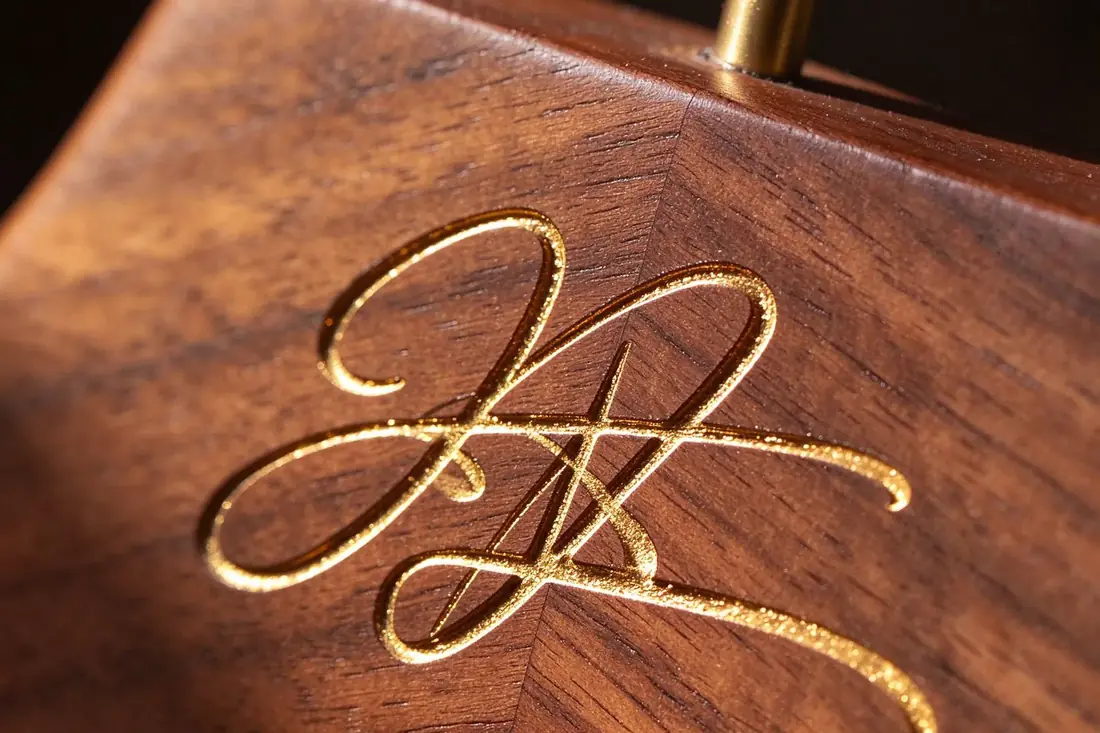
Our main method goes one step further: after engraving, the recess is filled with gold. The mark then has two things at once — the depth of the cut and the contrast of the metal, which is why it reads on pale beech and on dark walnut alike. Bare engraving relies on shadow, and shadow disappears on a dark wood under warm light; gold does not.
What it is good at
Gold-filled engraving is the most legible of the methods on wood, because it does not depend on the wood's own tone. It carries no die cost, it does not lift like a plate, and it survives handling better than a print because the gold sits inside the cut.
It is also the method that reads as both restrained and finished: at arm's length the mark is clear, and from across a room it reads as a thin gold line rather than a block of colour.
Where it struggles
Fine detail. A thin serif or a hairline in a monogram can fill in or burn wide, because the laser's spot has a minimum size. Very small marks on very dark wood also lose contrast, which is a wood problem as much as an engraving problem.
Depth, grain and the direction of the cut
Engraving depth is set by the power and the speed of the head, and the result depends on the wood beneath it. A close-grained beech cuts cleanly and holds an edge; an open-grained walnut can show a slightly frayed outline where the grain tears. The grain direction matters too: a stroke that runs across the grain reads differently from one that follows it.
This is why an engraved sample from one species is not a reliable preview for another, and why the proof is made on the wood the order will use.
What to specify for a gold fill
Three things belong on the order, and all three are checkable on the sample. The gold tone — a warm gold, a pale gold or a brass — because two golds side by side read as two different brands. The fill coverage, meaning whether the gold sits only inside the cut or is polished level with the surface. And the line weight of the cut, because a fill reads heavier than a bare engraving of the same artwork.
Where the mark has fine detail, the gold makes it more visible and also more critical: a filled hairline is a strong line, and a filled mistake is a strong mistake. That is why the proof at final size happens before the sample, not after.
What to send for engraving
A vector file, with the mark simplified to the strokes that will still read at the intended size. Where artwork has fine detail, the proof step exists to find out which strokes survive — before the production run rather than after.
Method 2: metal nameplate
How it marks
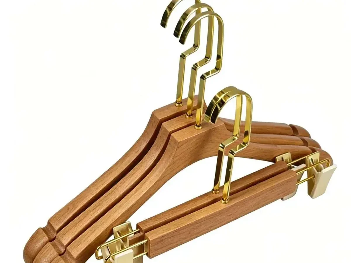
A thin plate is fixed into a recess or onto the face, so the mark sits proud of the wood and reflects light rather than absorbing it. It is the only one of the three that reads as a separate object — a deliberate contrast with the wood rather than a mark inside it.
What it is good at
Readability at distance and a material contrast that reads as premium. Because the plate carries its own surface, it works on dark wood where tonal methods disappear, and it survives handling better than a printed mark because the surface is metal rather than ink.
Where it struggles
It needs a recess or a fixing, which means the hanger is designed for the plate rather than having one added afterwards. And it is a second material on a natural object: where the brief is "quiet", a plate can look applied rather than integral.
Why the hanger is designed around the plate
A plate needs a flat seat and a fixing. Where the plate is recessed, the recess is cut into the shoulder before finishing; where it is fixed on the face, the fixing method is part of the product. A hanger designed without a plate in mind can still take one, but the result is usually a plate that sits slightly above the shoulder curve rather than following it.
That is the reason nameplates are specified at the same time as the model rather than added later — it is a design decision disguised as a branding decision.
What to send for a nameplate
The artwork as a vector, plus the intended plate size and shape. Where the plate has a die or a cut shape, that shape is part of the specification and is agreed at proof rather than at delivery.
Method 3: hot stamping
How it marks
A heated die presses a foil against the wood under pressure, transferring a thin layer of colour into the surface. The mark reads as a flat area of colour rather than as depth or reflection, so it depends on the contrast between foil and wood.
What it is good at
Colour. Hot stamping is the method that can carry a brand colour onto the hanger, and it is the most compact of the three for small marks, because the die can hold fine detail that a laser would burn away.
Where it struggles
Wear at the point of contact. The foil sits on the surface, so the area a hand grips — usually the shoulder, exactly where a mark often goes — is where it ages first. On a hanger that is handled daily rather than displayed, that is the relevant weakness.
Foil colour and the contrast problem
Foil comes in metallic and pigment versions, and the choice is really a contrast decision: gold and silver read as reflection on any wood; a dark pigment foil needs a light wood; a light foil needs a dark one. On a mid-tone walnut, a mid-tone foil is the combination that disappears at a distance.
Where a brand colour has to appear exactly, the foil is matched to a reference and confirmed on a sample — the same logic as a lacquer colour, and with the same conclusion: the object, not the screen, is the reference.
What to send for hot stamping
Vector artwork, the foil reference, and the intended mark size. The die is made to the artwork, so a change after the die is cut is a new die rather than a setting change — the one place where this method punishes late decisions.
Method comparison
| Method | How it marks | Best for | Weak point |
|---|---|---|---|
| Laser engraving with gold fill | cut, then filled with gold | the default: reads on any wood tone | fill and line weight must be specified |
| Laser engraving, bare | cut, no fill | quiet marks on pale wood | disappears on dark wood |
| Metal nameplate | sits proud, reflects light | premium display, dark wood | needs a design that carries it |
| Pad printing | ink pressed onto the surface | brand colour, flat marks | wears on high-touch areas |
| Hot stamping | foil pressed into the surface | brand colour, small marks | wears where hands grip |

Position: where the mark sits
The three zones
A hanger has three usable places for a mark, and they behave differently at distance:
Why the shoulder face is the default
It is the widest flat area, it faces the person looking at the rail, and it is not covered by the garment when the hanger is loaded. A mark placed there is read without effort, which is exactly what a brand mark needs to be.
Why the shoulder is a curve, not a plane
A shoulder face is curved along its length and slightly crowned across it. A mark printed on artwork assumes a plane, so on the hanger it either follows the curve or sits on the crown and reads unevenly. Engraving and stamping follow the surface; a rigid plate sits on it.
That is why the sample is the proof for position rather than the drawing: only the sample shows where the mark lands on the curve.
Why position has to be written down
"Centred on the shoulder" is not a specification. A shoulder face is a curved surface, and two factories will read the instruction differently — one measuring from the neck, one from the tip. Write the zone and a dimension, and the proof becomes a check rather than a negotiation.
| Zone | Visible at | Suits |
|---|---|---|
| Neck end | close range only | discreet hotel marks, serial marks |
| Shoulder face | arm's length | the default for hotels and retail |
| Outer shoulder | partly hidden by the garment | almost nothing — it disappears when loaded |
Proofing: from artwork to sample
What proofing is for
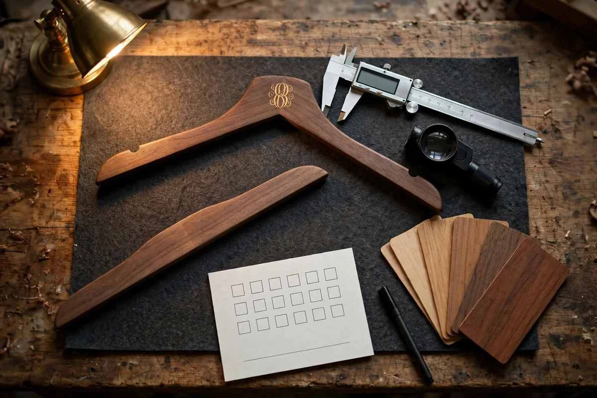
Proofing exists to find the three failures that artwork hides: detail that will not cut cleanly, a size that will not read at the intended distance, and a position that lands on a curve. All three are cheap to fix on paper and expensive to fix on a production run.
How long proofing takes
The artwork proof itself is usually a day or two — a file exchanged, a size agreed, a position measured. The physical sample is where the calendar goes: 7–15 days, because a sample is a production step, not an email attachment. On a first order that sampling window sits inside the 40–55 day full cycle; on a reorder where the mark is unchanged, it is not needed at all.
Where a die is involved — a nameplate shape or a hot-stamping die — the die is made before the sample, and a change to the artwork after the die is cut is a new die. That is the one place in the logo workflow where deciding late costs money rather than time.
The proof sequence
The sample approval record
That sheet is the one a later reorder is checked against, so it deserves the same care as the hanger specification itself.
Why a photograph is not a proof
A photographed mark shows colour and shape but not depth, and depth is most of what distinguishes a good engraving from a shallow one. Approve the sample in the hand, under the light it will live in — the same rule as a colour match, and for the same reason.
What goes wrong when proofing is skipped
Two failures we see regularly: a monogram that fills in because the artwork was never tested at size, and a mark that sits higher on one batch than another because the position was described in words. Both are visible in a sample and invisible in an email.
| Check | What to supply | Decided by |
|---|---|---|
| Artwork | vector file, single colour or defined colours | brand owner |
| Size | the mark's width on the hanger | brand owner and factory |
| Position | zone plus a measurement from the neck | brand owner |
| Depth or foil | engraving depth target or foil reference | factory, confirmed at sample |
| Sample | a physical hanger with the mark applied | brand owner |
| Check | Accept when | Recorded by |
|---|---|---|
| Artwork version | matches the file supplied | brand owner |
| Size | measures as specified on the hanger | brand owner |
| Zone and position | within the agreed dimension from the neck | brand owner |
| Depth or foil | reads as intended under the target light | brand owner + factory |
| Finish around the mark | no halo, tear or lifting | factory |
Matching a mark across a range
One mark, several hangers
A range usually carries two or three thickness bands — a coat band at 4.5 cm, a shirt band at 2–3 cm, a T-shirt band at 1.2–2 cm — and the same mark on all of them sits on surfaces of different size. A mark that fills the coat hanger's shoulder face will crowd the thin frame, and a mark sized for the thin frame will look lost on the coat hanger.
The usual answer is one artwork in two sizes: the full size for the coat band, a reduced version for the thinner bands, both approved at proof. The alternative — one size everywhere — works only where the mark is small enough to sit comfortably on the smallest frame in the range.
Men's and women's lengths
The mark position is measured from the neck, so it stays consistent between a 45 cm men's hanger and a 39 cm women's hanger even though the shoulder length differs. That is one reason to specify position from the neck rather than from the tip: it survives a length change without re-proofing.
Multi-brand and no-brand ranges
A shop that carries several brands usually wants the hanger to be neutral, so the rail does not advertise one label on another's garment. A hotel that carries its own label wants the mark on every hanger in the room, including the spare. Two opposite answers to the same question, decided by who the rail belongs to.
The mark decision therefore belongs with the range decision rather than after it. Where the boutique programme is built per collection, and the luxury retail format is built around display, the logo is usually the first thing specified and the last thing approved.
What a distributor range needs
A distributor selling several brands usually wants no mark at all, or a neutral one, because the carton and the hanger carry the distributor's own identity rather than a hotel's. The same hanger without a mark is a different line on the order, and the distributor programme covers the neutral packing that goes with it.
What a logo cannot fix
The honest limit
A mark does not improve a hanger. It advertises whoever put it there, and it will look as good as the object it sits on — a shallow engraving on a poorly finished shoulder is still a shallow engraving. Buyers sometimes specify the logo first and the thickness second, which is the wrong order: the hanger is the product, the mark is a signature.
Where marks fail for reasons that are not the mark
Three cases, all common: a mark placed where the garment covers it; a mark on dark wood in a tonal method, invisible under room light; and a mark that changes size between batches because nobody wrote the size down. None of these are the logo's fault, and all of them are specification failures.
When the mark and the garment disagree
The mark needs a flat area; the garment decides where the flat area is covered. A wide mark on a shoulder face disappears under a coat's shoulder pad; a mark placed low on the shoulder collides with the garment's own label. The resolution is almost always to move the mark rather than resize it — the smaller version of a mark in the right place reads better than a large one in the wrong place.
That is a conversation to have at proof, with the garment in hand.
What to write on the order
Six lines make a logo order repeatable: method, artwork version, size, zone and dimension from the neck, depth or foil reference, and the approved sample reference. Everything else is production. The customisation page covers how the logo decision sits alongside wood, thickness and finish; the quality page covers what is checked at inspection; and the fields a written brief should carry are in the specification sheet guide.
If the mark is part of a private-label programme, the carton usually carries the same artwork — proofed in the same round, which is the private-label route. Specification sheets for the logo models can be requested from the downloads page, and the commercial answers are in the FAQ.
The hanger models the mark can be applied to are on the custom logo range and across the wide-shoulder and clip lines; the full specification method is in the hanger specification guide, and the workshop that does the engraving and plating is described on the about page. If the programme also needs cartons branded, that sits in the customized service scope.
Send the artwork and one garment, and we will tell you which method the mark survives in. We do not publish durability in years. The behaviour under handling is described, and the sample is what settles finish, depth and wear.
FAQ